When breakfast meets cocktail hour: Australia's most highly awarded distillery Archie Rose Distilling Co. is launching ArchieMite Buttered Toast Spirit. In advance of the May 8 [mate] launch, PKN spoke to Squad Ink branding and design studio about the packaging execution.
Buttered sourdough toast with yeast extract spread has to be one of Australia's most popular breakfast or even any-time-of-day meals. Archie Rose Distilling Co's new limited edition ArchieMite Buttered Toast Spirit is an experimental dip into this side of Aussie culture, bringing to market a savoury, buttery, unaged spirit inspired by Australia’s love for umami-rich breakfast spreads.
Sydney-based branding and design studio, Squad Ink, worked alongside Archie Rose to create the packaging which, the studio says, “respectfully marries popular Australian consumer culture with progressive craft distilling”.

“The challenge for us was to capture the nostalgia that comes with Australia’s favourite supermarket breakfast spreads, yet deliver a packaging design worthy of a premium artisanal spirit. In many ways it was a lesson in letting go of the brand constraints and having a bit of fun,” says Matthew Squadrito, director of Squad Ink.
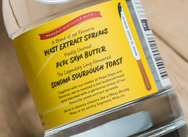
Only 3000 bottles of the possibly divisive spirit has been created using a combination of individually distilled ingredients including 25kg of freshly churned Pepe Saya Butter, 15kg of toasted Sonoma sourdough bread and a selection of blended yeast-extract spreads (“mites”).
“Some people will hate it, some will love it. Some people will drink it neat in a Martini (we recommend a Gibson) and some will like just a delicate touch of its flavour in another cocktail. If you like umami-rich flavours, you’ll really enjoy it,” says Harriet Leigh, Archie Rose head of Hospitality.
Off the back of multiple limited-release successes including Archie Rose X Horisumi, a gin collaboration with acclaimed tattoo artist Kian Forreal (Horisumi); and more recently the Archie Rose Summer Gin Project, there is an expectation ArchieMite will receive the same wide-reaching interest.
For the packaging designers, this served up an opportunity to present the more playful side of the Archie Rose team.

“Over the five years of building the Archie Rose brand together, the sheer dedication and uncompromising standards of the team is incredibly inspiring. The team are living the dream over there and having a ton of fun along the way! We wanted the next limited-release to express that,” says Squadrito.
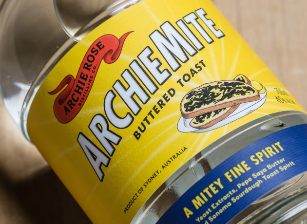
Bold angled block type and a retro-inspired illustration evokes nostalgia. “It’s a blast from the past yet refreshingly current,” says Squadrito.
The label is digitally printed (see credits below) in vibrant yellow and features an all over textured grain emboss for a premium result. An added gloss high build screen has been applied over graphics to ensure that the rich yeast-extract spread sings out off the label.
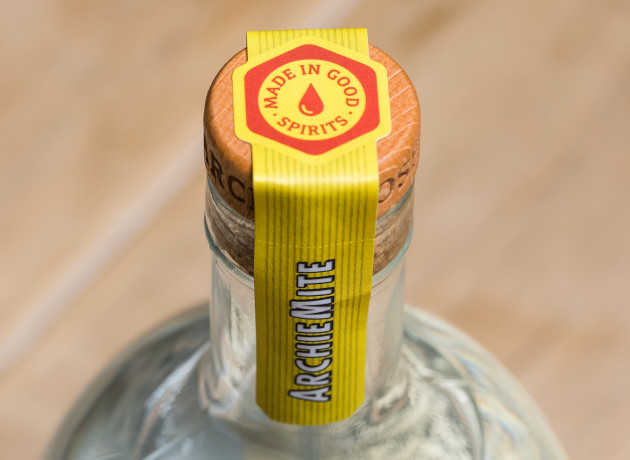
The vertical neck label is hand applied post-filling and includes a horizontal perforation so the label remains intact after opening.

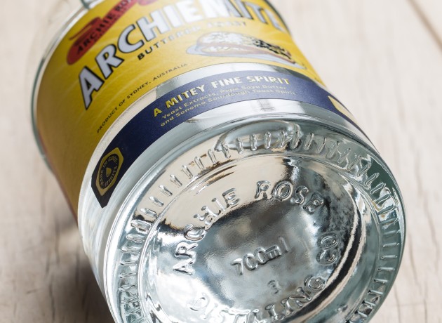
A standout element is the custom flint bottle. The shape is inspired by the impressive copper pot stills at Archie Rose. It features a 360-degree recessed label indentation across the body so that the full-wrapped belly label can be profiled as well as an embossed heal – the mark of a true artisan product.
PACKAGING CREDITS

Print specifications:
Process: CMYK digital print + emboss grain + matte varnish + high build screen + overprinted variable data
Stock: KILLER WHITE S2030 PET30
Press: HP Indigo WS6000
Printer: Multi-Color Corporation
Labelling House: Hunter Bottling Co.
And to tempt your tastebuds... take a look here:


