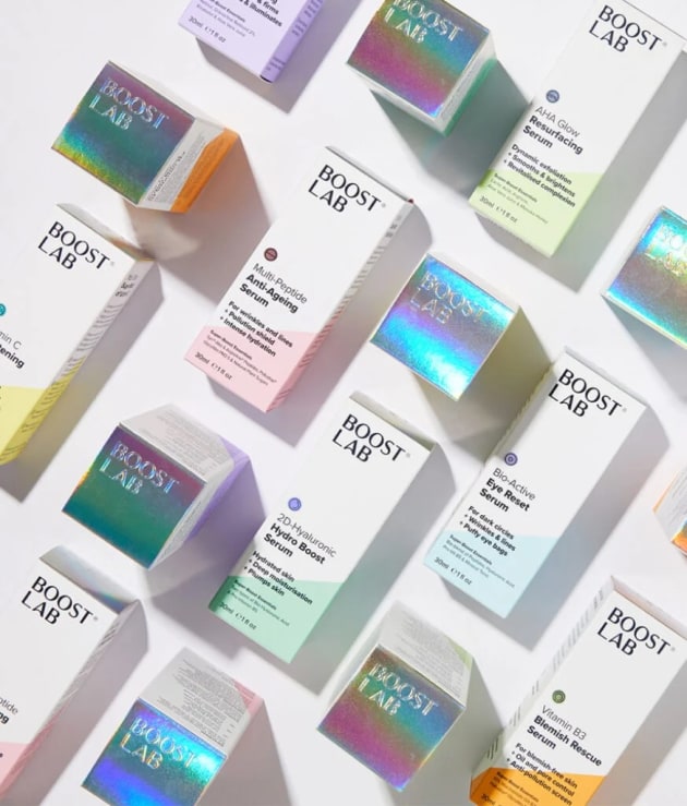
Squad Studio was recently approached by skincare brand Boost Lab to simplify its design o convey a targeted message. The studio took to navigating the “careful balance” needed to do this while maintaining shelf appeal.
Terry Squadrito, director of Squad Studio, said in a LinkedIn post that in the world of beauty and wellness branding, “razor-sharp clarity of message” is critical for brands to cut through the sea of startups.

The design brief was to find a solution to the challenge that customers can be overwhelmed by complex chemical compounds, excessive choice and a lack of confidence in choosing the right products for their skin.
Boost Lab wanted its brand to simplify the process for the consumer, focusing both on the outer carton, which is produced by Forbs Packaging, and the serum bottle’s label, which is printed by Adhesif Labels.
Squad Studio rose to this challenge by focusing on clear and concise messaging supported by an iconography system that could help customers easily navigate the product best suited for their skin needs. The measured use of vibrant colour and a rainbow laser foil was used to make the packaging stand out on the shelf.
The brand and packaging was designed in a way that aimed to evoke “radiance and science-backed-potency” — balancing ‘shelf appeal’ with clear cut messaging.


