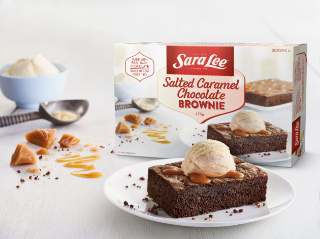
BrandOpus has partnered with Australian dessert specialist Sara Lee to redesign its classic range of frozen sweets.
The global branding agency introduced a bright redesign for the products, aiming to update the look and feel for a modern audience, as well as restore confidence for the Sara Lee name in the frozen food market.
BrandOpus Australia managing director Nikki Moeschinger said the new design evokes a 1950s nostalgia feel with its warm colour pallette of reds and yellows, while foregrounding a modern Australian kitchen and all the mess that comes from cooking with love.

“The new designs are a true reflection of family life, it isn’t always perfect but feels real and authentic,” she said.
"We developed a 'heart' device as a container for the product name and locked it up with the Sara Lee brandmark. This subtle symbolism is also used to communicate key marketing messages, including provenance 'Baked in NSW' and history 'Since 1971'."
The packaging was printed by Melbourne-based printer GPIA on Simcote 400um and uses two spot colours as part of the design, with iMS Global involved in pre-press.
BrandOpus operates its Australian division in Melbourne, as well as international offices in London and New York.


