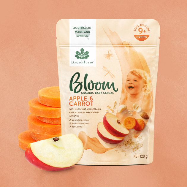
Sydney-based design and branding agency Boxer & Co has partnered with Brookfarm to create a sub-brand – Bloom – for its organic baby cereal products. The result for the branding and pack design is free-flowing and illustrative with a vibrant, watercolour wash.
Boxer & Co worked holistically, from naming through to illustration, typography, photography and artwork to create Bloom, ensuring a hand-crafted and natural vibe across the range.
“The design has a general looseness to it, which gives a relaxed and pure vibe and is different to other designs in the category, which seem to start from a position of fun and brightness or a rigid structure. It’s a breath of fresh air in a noisy category,” Boxer & Co design director Greg Boulting told PKN.

The soft colour palette for the Bloom range was influenced by the Byron Bay region Broomfarm is based in, as well as the pastels which are frequently used for baby clothing and décor.
The hand-drawn elements aim to give a carefully crafted impression, Boulting adds, “a feeling similar to how one would blend their own baby food if they had the time”.
“Watercolour birds, butterflies and dragon flies appear to flutter across the pack, representing the diversity of the Brook family’s own hinterland plantation,” he said.
To complement the illustrative elements, Instagram-type style photography was used, with ingredient cameos displayed in a relaxed and natural fashion to “enhance the quality and realness of the product,” said Boulting.
A single painted macadamia leaf illustration and Boxer & Co’s choice of colour for the Bloom logo casually link back to Brookfarm’s core brand identity, where the team used a tab device to host the Brookfarm logo to sit “proudly in an endorsing way, rather than owning the pack design”.
Brookfarm Bloom is now available in three varieties – Smooth Banana, Smooth Pear and Apple Carrot.


