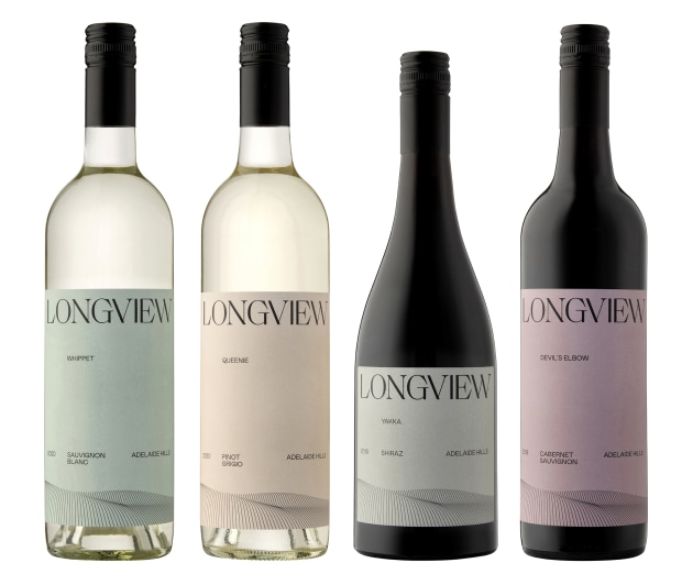
To celebrate its 20th vintage this year, South Australian vineyard Longview has created new packaging for its Longview and Macclesfield branded wines, working with Adelaide-based Studio Landmark for a new look.
The Longview team said it wanted to focus, refine and return to its “strong sense of place” branding by positioning the physical location, micro-climate, geology and environment of Longview at the centre of all communications.
“We make wines that stand the test of time and therefore we wanted to create something akin to a modern classic,” Longview general manager Peter Saturno said.
“We see so many eye-popping labels now that it is hard to identify the actual producer. However, what we realised is, that as much as we love creating exciting new packages and stories, we began to lose focus on ‘Longview’ – the brand.”

Longview’s new labels were printed by Multi-Colour Corporation and feature a foil and emboss on the front and a deboss on the back.
The colour palette refers to the tones of the rolling hills, blue skies, and natural bushlands, while its ‘vista’ graphic, “references Longview's stunning panorama – a key element of the Longview brand”.
“Everything about our new brand points back to our beautiful and unique location and this has been the basis for our new look labels,” Saturno said.
The Macclesfield wines range is a premium and small batch, with the look aiming to represent “where geology, art and wine intersect”, featuring a vein of pink marble on pack and echoing "the undulating topography of the vineyard".
The new Longview labels are now rolling out nationwide.


