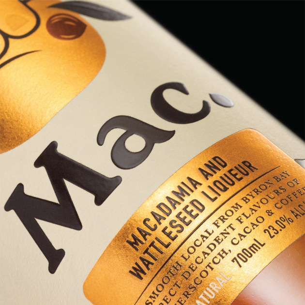
Sydney design agency Co-Partnership has won gold at the 2019 Fab Awards in London for its packaging design of macadamia nut and wattleseed liqueur Mac, taking the vibe of Byron Bay overseas.
The design for the Brook family's liqueur Mac was inspired by 60s and 70s surf culture, nodding to the poster for surf film The Endless Summer, and heroes the friendly 'shaka' hand gesture to encapsulate Byron Bay's laid back vibe.
“As you drive into Byron Bay there is a sign that says ‘cheer up, slow down, chill out’, and we wanted to create a brand that beautifully captured this effortlessly smooth vibe,” said Co-Partnership co-founder Max Harkness.
“The ‘shaka’ sign that you see on the front label is a friendly gesture known in the surf community to say ‘welcome’. We love how this universal hello holds the macadamia branch.”

Harkness said the colour palette was directly influenced by the liqueur's flavour profile – roasted macadamias, butterscotch, cacao and wattleseed, “AKA bush coffee” – and is complemented with gold foiling, which can “catch the eye from a dimly lit back bar”, as well as offering a premium cue.
As the distillery sits in the heart of the rainforest of the Northern Rivers region in New South Wales, Harkness said the capsule's leafy design references the area, as well as the Brook family's passion for the rainforest's regeneration, with many of the liqueur's ingredients sourced from there.
Co-Partnership's design also features a playful tone in its messaging, using phrases such as, “Mix up a little somethin’ somethin’” and “A smooth local from Byron Bay”.
“It was great to bring out the personality of the brand through the copywriting to make a connection with the consumer and build a smile in the mind,” said Harkness.
Mac by Brookie's is available in independent Australian drinks retailers, as well as at the Cape Byron Distillery and online.


