Denomination has given Italian liqueur distillery Opal Nera a dark pack design refresh for its sambuca-based drink, aiming to help re-establish the brand as the premier product of its kind on the market.
The design agency kept the classic and much-loved Opal Nera bottle while aiming to create a modern, luxe look. Opal Nera was created by family-run Distillierie Francoli in the 1980s, and is made from 10 ingredients, including elderberries, which give the drink its purple hue.
The Denomination team aimed to create a design that “looked at home in trendy inner-city bars”, while also keeping existing consumers and attracting new ones.

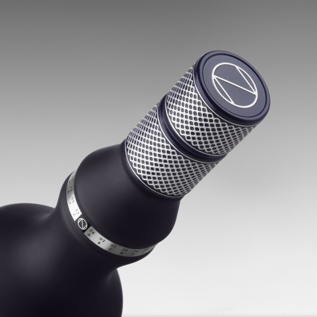
Contemporary typography, as well as a distinctive ON logotype with negative tension on the bottle was used; additionally, a textural capsule with luxury semiotics emphasises the product as prestigious.
The design team also added a code beneath the logo for consumers to decipher using a sequence of letters and numbers from the rim to reveal the words ‘dark secret’.
“Opal Nera’s unique selling point – its ‘dark secret’ – is that it turns purple on contact with ice, so we modified the bottle to reflect that. At first glance it looks like black frosted glass but, on pouring, a purple colour that matches the liquid is revealed,” said Denomination CEO Rowena Curlewis.
“We wanted to tell the story in a unique way, and our ‘secret code’ mechanism is distinctive and really engages the consumer.”
Denomination said the latest refresh has made Opal Nera relevant to the modern consumer, while tapping into “an explosion” in the popularity of Insta-worthy liqueurs and aperitifs.


