Sydney's Percept Brand Design worked with department store Big W to rebrand its toy brand through a packaging overhaul.
Big W's in-house brand, Tinkers, is aimed at 0-3 year olds and includes toys across the outdoor, plush, preschool, bath, baby, trucks, wooden, and imaginative play categories.
Finding Tinkers was losing traction against competitor brands, Big W decided on a rebrand aimed at “inspiring fun, promising satisfaction, and resonating with parents and grandparents”.

The department store asked Percept to redevelop the Tinkers logo, colour scheme, packaging design, layout and messaging hierarchy.
This was followed by a comprehensive style guide to enable consistent production of packaging by a variety of offshore suppliers.
A lively logo
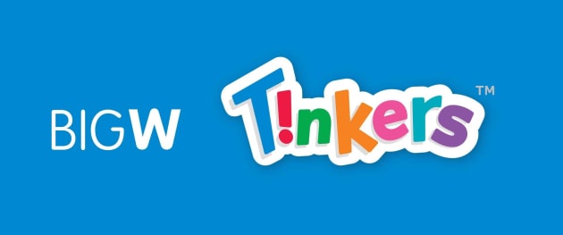
Percept's first step was to create an informal wordmark with sporadic spacing to give energy, liveliness and fun to each letter that makes up the Tinkers logo.
The new logo communicates clear ‘play signals’ and features a graphic exclamation mark – a reversed ‘i’ – which alludes to excitement without detracting from the overall integrity and readability of the name, according to Percept.
The exclamation mark was also used as a device to bring attention to the age dinkus, features and benefits, value proposition and quantity information.
Each colour from the logo is used with custom illustrated backgrounds to distinguish between different categories.
Percept also devised a grid formula for the packaging rollout to ensure pack proportions and brand assets are used correctly and consistently.
In the process of designing the new packaging for the range, key products were used in each category to allow us to overcome ‘worst case scenarios’ such as long product names and difficult pack shapes.
The overall refresh added energy, liveliness, and a uniform visual look which strengthens the Tinkers brand and conveys its values.


