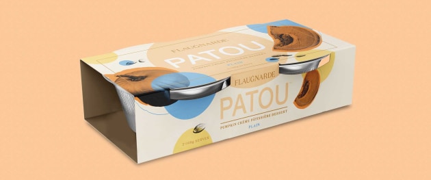
Flaugnarde is the newest addition to Australia’s premium dessert market and has launched in stores with a colourful range of packaging designs created by Sydney designer Percept.
Inspired by Mediterranean cuisine, the flagship dessert, Patou, is a savoury-sweet combination of crème pâtissière and pumpkin, with a subtle nod to the vegetable celebrated with an added stem to the ‘G’ on the logotype.
“Pumpkin is the key ingredient of all products, so we also used orange to accent this throughout the range,” said Percept principal Lewis Jenkins.
"Then each variety features a colour-way influenced by its flavour.”

Jenkins said a slightly muted palette was chosen to bring sophisticated feel to the range, balancing the colour splashes, black and white imagery and gold foil stamping to challenge category conventions and stand out on shelf.
“Each product works with the system of black and white ingredient cameos and the common orange and its choice of feature colour to distinguish each type, while giving a feel of equal value within the group,” he said.
“A subtle [gold foil] embellishment for the brand suggests it stands for quality, attention to detail and the appreciation of the finer things in life, much like the dessert itself.”
Flaugnarde’s Patou dessert is available in eight flavours – plain, hazelnut, chocolate, maple walnut, coconut, pistachio, sultana and choc brownie – and is sold in select stores around Australia.


