Design company Boxer & Co helped a new children's food brand stand out in the frozen food aisle by disrupting its usual brightness.
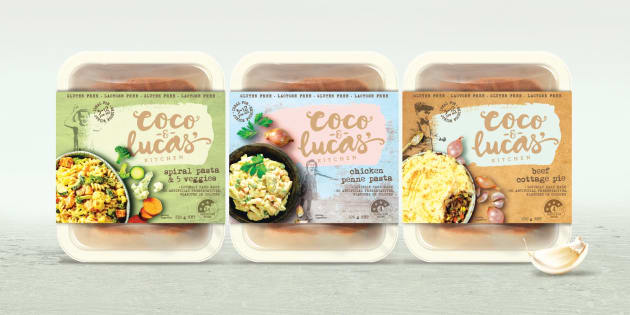
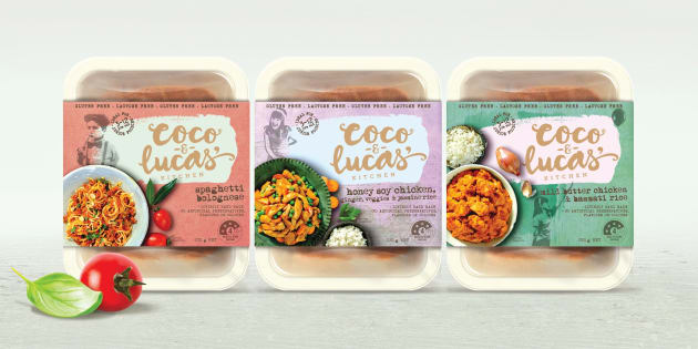
It went with a contemporary yet rustic feel and quiet pastel colours for the packaging of Coco & Lucas’ Kitchen.
The just-launched brand offers healthy, home-cooked frozen meals for fussy eaters, and is the concept of entrepreneur Diem Fuggersberger. She wanted to create “the sort of delicious food you would make yourself if you just had the time.”
Agency and client were aligned in the vision that the design should target parents rather than appeal to children with the usual bright colours and jovial characters.
Coco and Lucas are the founder’s daughter and nephew – one a fussy eater, the other restricted by food intolerances.
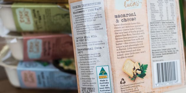
The packs have a range of rustic background textures like painted walls, cardboard and wooden tables.
The product photography is editorial and homely in its style.
The free-flowing logo is crafted to appear creative and ‘of the hand’. and is grounded by a serif font for the word ‘kitchen’.
Street-art has inspired the style of the photographs of Coco and Lucas themselves, which feature on the pack.
With the addition of a large paint daub to house the logo, the overall feel is modern, approachable and scrapbook like, according to Boxer & Co.


