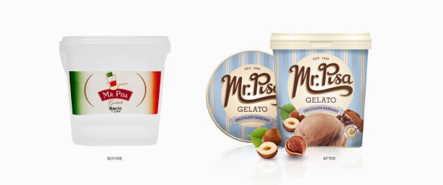
Heritage gelato company Mr Pisa asked Sydney-based design agency to modernise its look and packaging to refresh its premium brand.
From the outset, the goal of the Percept team was for the packaging to better represent quality and establish a point of difference from the competition.
The new branding and packaging design needed to represent Mr Pisa as an "authentic yet innovative" gelato brand which offers a premium quality product.
Up till the company contacted Percept, the product had been sold in clear plastic containers, which is problematic if the gelato crystallises and looks less than appealing.
The solution was to use cardboard tubs, solving the product presentation issues while adding to the authentic and traditional feel of the brand.
Product and ingredient renders were also commissioned to help differentiate between each variety and visually represent the promise of flavour.
Mr Pisa has been making Gelato since 1968, and to capture this heritage Percept hand-crafted the logotype to achieve a vintage, nostalgic aesthetic.
Bold pastel blue stripes on pack give a nod to the original cart the family used when they first started selling gelato around Sydney Harbour.
For more on this refresh and other design stories, flick through our digital issue here.


