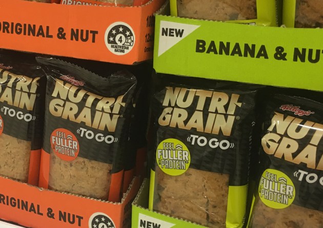
The rise of on-the-go breakfasts has led to a new product range and packaging design for Kellogg’s Nutri-Grain brand.
Kellogg saw an opportunity to provide a unique product offering that delivered on taste, and asked the team at design agency Jam & Co to perfect the packaging look.
With competitors Up&Go and Weet-Bix Go already taking market share, it was critical for the new product to stand out on shelf.
Leveraging the Nutri-Grain brand, Jam & Co tapped into the male psyche with the design, which uses strong, bold, sporting colours.
The “fuller for longer” phrasing also speaks directly to the male demographic, signifying a satisfying eating experience.
At the same time, the prominence of the Nutri-Grain logo makes for easy navigation and reassurance for mum.
The patterned background links to the original, but has been contemporised.
The new range includes flavours of Original and Nut, and Banana and Nut.


