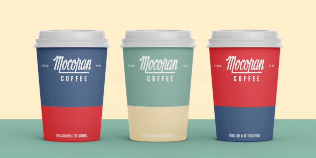
Suntory’s Mocopan Coffee has turned to brand agency Percept to assist in its rebranding, updating its packaging design and undergoing a refresh of its brand mark.
Operating in an extremely competitive industry flooded with new specialty coffee brands, one of Mocopan’s concerns was that its brand might to start to appear dated, and in turn, lose shelf presence.
Percept was called on to refresh the Mocopan brand, all while considering a distinctive colour palette that will ensure relevance and visibility of its packaging design within the context of today’s café culture.

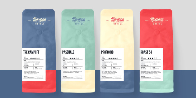
With this challenge in mind, Percept says it took the opportunity to bring out the best of Mocopan’s coffee, implementing a retro-themed colour palette, paired together with '70s style typography to “create a vintage, yet timeless aesthetic”.
The artwork was printed on Rewind Film, taking a utilitarian label approach for product details, which combined content that was consistent across every bag (company information, legals, contact details), while also leaving an area for precise manual printing on individual bags (roaster name, roast date, use by details) during the product packing process.
The new Mocopan brand was rolled out across different variations of packaging design, including coffee cups, coffee labels, and pouches with various flavour SKUs.


