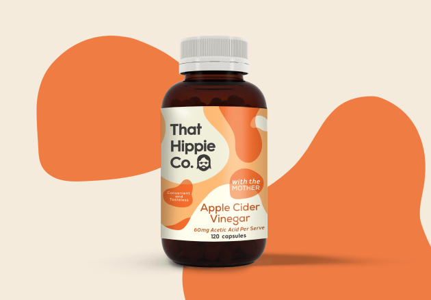
Design agency Our Revolution has brought back an old-school feel to the latest packaging design for health foods brand That Hippie Co.
Producing organic and vegan products to help consumers look after their gut-health, That Hippie Co. focuses on “new-age health stuff rooted in old-world wisdom”.
The lava lamp became symbolic for Our Revolution to visually represent gut health and further accompanied with a warm palette of orange, red and pink, utilised across each product.

“We explored the world of a ‘hippie’ and sought to combine the aesthetics of their environment with the meaning of taking care of your gut health,” said Jen Doran, Our Revolution creative director.
“The soft, slow moving shapes provided a visual language that spoke to the product, benefit and brand.”
That Hippie Co. director Andrew Doenicke said he was delighted with the new design and set the potential for expanding the product range.
“The packaging design is a reflection of our brand. Our Revolution understood our brand vision and is helping us to fulfill our ambition by setting the right foundation for future growth,” he said.
Since the launch of the new packaging design, That Hippie Co. now distributes nationally across Australian health food stores.


