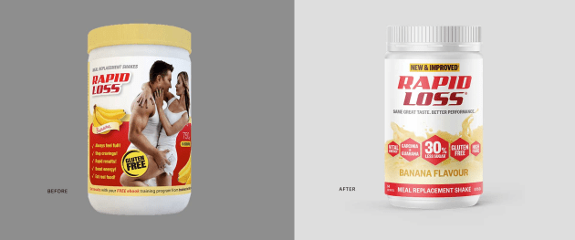
Meal replacement brand Rapid Loss has revamped its packaging design, working with Sydney-based design agency Percept to create a fresher, cleaner and more modern solution for the Australian brand.
The redesign has a focus on colour, flavour and energy combined with the product's scientific benefits, to improve the presence of Rapid Loss in the noisy and crowded retail environment.
Compared to its previous design, the Rapid Loss packaging includes a modernised logo, and has removed the imagery of people on its design as a result of changing beauty standards, says Percept design director Samuel Byrnes.
“In 2019, the idea of an 'ideal body type' is a misnomer,” said Byrnes.
“Consumers may not identify with a particular image of a ‘healthy’ person but you can’t argue with data. For this reason we made an intentional move away from people imagery and gave focus to highlighting and showcasing the scientific health benefits.”
“Shifting the focus from lifestyle imagery to the health benefits meant that these details needed to take centre stage. Along with the newly refreshed, centred logo, the whole front of pack was given a simpler, more balanced weighting. The redesign coincided with the introduction of a new and improved recipe, so it was important to highlight the lower sugar content.”

Byrnes said the the old Dieter Rams adage of “less but better” rings true now more than ever as consumers are bombarded with thousands of messages each day.
“Retail packaging design must engage, and be understood, quickly. Brands only have a few seconds to engage and capture attention and imagination.”
Percept also removed the “excess clutter” around the Rapid Loss logo to give it a “more prominent, elevated position, and create a fresher, cleaner solution”.
The new recipe and packaging design for Rapid Loss is now rolling out in stores.


