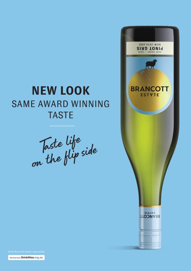
Pernod Ricard is flipping its New Zealand wine brand Brancott Estate on its head, collaborating with Auckland-based studio Tried & True Design for a label design refresh.
The new design taps into the history of the brand, which started in Montana in 1973, as well as “paying homage to the sheep”, which have an “integral role on the Brancott Estate vineyards”.

“Our unique new positioning and label pays homage to Brancott Estate’s Kiwi roots and different thinking. Every feature and design component has been carefully thought out to celebrate where we are from which is the other side of the world,” global marketing director for Pernod Ricard Winemakers Eric Thomson told PKN.
“‘Taste Life on the flipside’ refers to New Zealand being on the other side of the world and how we think differently.”
The new Brancott Estate labels are printed on bright, white uncoated Artic Plus, which features a gold foil disc and a gloss high build to elevate the brand and highlight the varietal, Thomson told PKN.
“Our new labels feature a bright and distinctive colour palate, including a dynamic blue that creates shelf standout in a category which is often a sea of white. The large gold disk also helps create an eye-catching focal point and point of difference,” he said.
“We also incorporated micro emboss details on the sheep illustration to add unique detail and create a tactile finish.”
Brancott Estate’s new packaging can be found across the entire range of Sauvignon Blanc, Pinot Gris, and Pinot Noir, and is available now from Australian liquor outlets at an RRP of $17.99.


