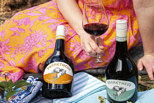
Prometheus Wine Company has launched its new Prometheus and Expressions wine ranges, presented in different shaped bottles and sporting distinctively coloured labels with striking artwork.
Bottles for both ranges were manufactured by Visy, labels were printed by Studio Labels, and closures were created by Guala; and both bottles and closures were sourced by bottler Vinpac.

unique lux bottle shape, and labelled with
angel-adorned designs.
Prometheus Wine Company's Andrew Starkey says that the youth-focused Expressions wine range is created with fun in mind. Presented in pretty and delicate clear flint bottles, the wine labels carry the names and colours that denote flavour profiles and feature striking, well-designed icons.
With names like Summer Squeeze (White) Berry Blast (Rosé) Sherbet Bomb (Pink Moscato), the wines in the Expressions range are primarily designed to attract the eye and give warmth, Starkey explains.
He says that the brand design had to reflect the flavour profiles, helping consumers to ‘drink the wines with their eyes’ and imagine each taste before the bottle is opened.
"The label design for these wines was also important," he said, pointing out that the artwork needed to convey the refreshing and thirst-quenching attributes of the summer wines.
The new Prometheus wine range was designed to evoke standout shelf appeal with its unique lux bottle shape, and angel-adorned label design.
Starkey explains that the motivation behind utilising the different bottle shape was to ensure that the range is never mistaken for a ‘standard’ wine.
"We know what we have a bottle that is both special and not easily found, and wanted to acknowledge that in our glass selection," he said, pointing out that the lux shape was manufactured by Visy in New Zealand and shipped to Australia.
Starkey said that the label design was created to convey equal parts of seriousness and warmth.
"Our wines are to be enjoyed by all, not just a select few. We also wanted them to be coloured so they each had their own personality. Colour is such a powerful part of our world and provides emotion and visual stimuli that impacts on the other senses."
He says the inspiration for the angel label on the front is from ‘the angels share’, which in wine is the small amount that evaporates when in barrel.
"It’s considered a ‘gift’ to the angels; just like we consider these wines a gift to the drinker," he said.
According to Starkey, the back label provides distinct icons that help consumers understand more about what the wine is and how it will taste.
"Consumers are wanting more information on what they consume than ever before. They’re also wanting to ensure what they consumer is compatible with their lifestyle choices. Being explicit about our winemaking techniques and how they fit into dietary considerations was a key requirement for us," he said.
Starkey explains that designs in the range are synonymous with the brand identity – Prometheus, who according to Greek mythology was credited with breathing life into clay, the most basic of ingredients, and using it to create human beings.
"At Prometheus Wines, we create a similar transformation every day, turning grapes into top-quality wine, with one major difference: there’s nothing basic about our grapes," said Starkey.
The wines are retailed at $14.99 (Expressions) and $24.99 (Prometheus). They can be purchased from Prometheus wines directly and are expected to be in retail stores soon.


