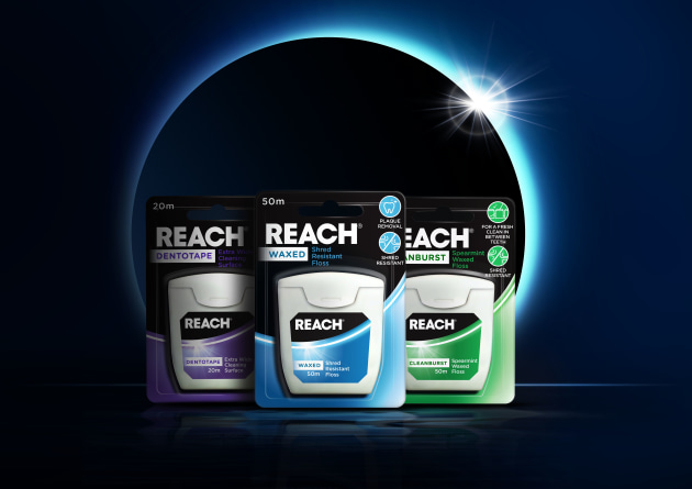
Oral care brand Reach has worked with Sydney agency Our Revolution to freshen its brand and packaging design, reintroducing Reach as an “old favourite” to the dental aisle.
With the Reach name present in dental-care for 50 years, Our Revolution created a contrasting dark and icy design for Reach to stand out among the cluttered category.

“Our focus was to pull out the original, innovative characteristics of the brand through a new, progressive design,” said Our Revolution creative director Jen Doran.
“The eclipse brand holding device can be used in off-pack communications. While retaining familiar attributes of the brand like the black background, it also allows for more distinctive variant colours to come through, highlighting individual products."
Research found by Our Revolution suggested 60% of purchase decisions in the dental-care section were based in-store, meaning the packaging design was vital in converting shoppers to buyers.
Doran said, “The packaging was key in communicating the key attributes of the products. They needed to be clear and easy to understand for shoppers to navigate.”
The latest packaging design for Reach products is currently being distributed in stores across the country.


