There are many significant design trends hitting the product packaging world right now. We take a look at vibrancy, luxury, and nostalgia.
Vibrant colour variants
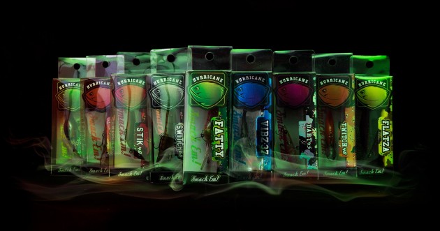
Various colourways are increasingly used to differentiate products and enable the package to be unique to the types of products within the range.
An Australian freshwater lures company, for example, employed The Marketing Mix to create a look using clear acrylic, silver mylar, and 300gsm artboard to aid in on-shelf standout.
The look of luxury
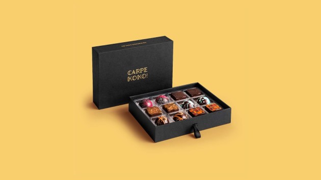
There aren’t many combinations of colour that convey the aura of elegance and beauty quite like black and gold.
Paired together, this duo continues to be the go-to palette for premium, high-end products.
This enduring medley conveys affluence and elegance, and is used to striking effect on the packaging for high-end chocolate client Carpe Koko, which commissioned design agency Jacob White for the range.
Intriguing and nostalgic
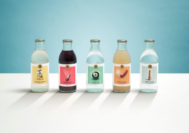
The designer of this beverage range referred to a time when tonics and elixirs reigned supreme and were crafted by apothecaries.
This minimalist approach reflects a growing trend in nostalgic labels.
“Our challenge was to reflect the premium, organic and exotically flavoured nature of the mixers and the darker aspects of the StrangeLove brand,” said a spokesperson for New Zealand's Marx Design.
“The colour palette was inspired by 1950s cocktail hours – classy but slightly sleazy.
“An expert illustrator hand-rendered the illustrations – the Dirty Tonic lipstick looks like an indication of class; with smudged lipstick hinting at a seedier underbelly.
"The post-modern type adds a premium touch.”


