Packaging design company Tweak recently completed two projects for a pain relief brand and a popular cold sore cream.
The owners of a dual-action tablet called Mersynofen wanted new branding that would strengthen the product’s core difference, so the Tweak design team used a split colour device to emphasise how its two key ingredients work together to relieve pain.
The design leverages Mersyndol's known and trusted brand attributes, according to Tweak.
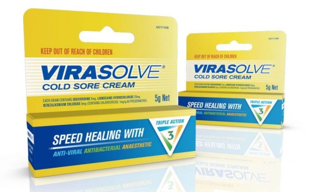
In another project, Tweak was asked to “triple the shelf shout” with a new design for cold sore brand Virasolve.
The three aims of the new design were to differentiate Virasolve from competitors, better communicate its unique selling proposition, and command attention on shelf.
The design evolution dialed up Virasolve’s equities and product claims with a new logotype – a Triple Action device that emphasises its key ingredients – and the retention of the signature yellow and white helps maintain brand recognition.
The pack form was also changed from a tube box to having a backing card for hangsells. The new format is aimed at increasing the product's shelf footprint.


