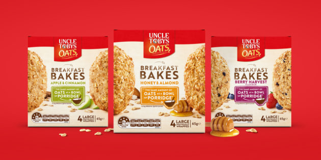
When Uncle Tobys launched its latest range of on-the-go morning snacks, Breakfast Bakes, it turned to Sydney-based branding agency Boxer & Co to ensure the warmth in its packaging design.
Breakfast Bakes was created as a filling breakfast solution to match a bowl of porridge, and to rival the liquids and biscuits in the on-the-go category.
Boxer & Co used vibrant colours to identify flavour profiles across the range, as well as depicting the 'real' goodness of oats and ingredients in each pack.
“Natural tones and textures were used to enhance the home-crafted feel the brand was trying to convey with this product. This also allowed for strong brand blocking and clear variant navigation against the neutral tones of the background,” said Boxer & Co design director Greg Boulting.

Ensuring the brand message of “all naturally hand-crafted ingredients” was achieved, the typography positioned front and centre on pack had “a huge role in communicating pack contents”, according to Boulting, as the irregular, slightly eroded typefaces and graphic elements were crafted to help bring this message to life.
In addition, the hand drawn elements further complement the achievement of “a natural unprocessed feel”, and are balanced with strong product photography to help “emphasise the real, unrefined nature of the products”.
“The product photography tessellates across the front faces on shelf, creating a highly impactful bank of product in the supermarket,” said Boulting.


