It was one of the most recognisable grocery labels in the country: Woolies’ red-and-white, no frills Homebrand.
Like other ‘own brands’ used by the country’s biggest supermarket chains, Homebrand offered a low-cost alternative product – with minimal decoration and personality.
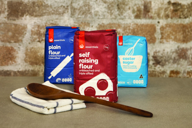
But that all changed early in 2016, when Woolworths ditched its red-and-white utilitarian pattern in favour of a more friendly Essentials own brand.
It was a bold bid to improve perceptions of its private label range in its fight against Coles and Aldi, and it affected nearly 1000 products under the Homebrand umbrella.
Essentials, Woolworths said, would offer the same value for money as Homebrand, but would not be afraid of colour. And the look and feel of the new range was placed in the capable hands of design agency Jack – part of the Frost*collective.
The agency’s strategist and head of packaging Lisa Mathews told PKN the team had already achieved “fantastic” results with Woolworths South Africa’s own-brand redesign, and felt the own-brand overhaul in Australia was a natural fit.
“The challenge was in how to make Woolworths own-brand products feel more down-to-earth Australian rather than just going with a cookie-cutter approach,” Mathews says.
“The simple pack iconography makes navigation clear, while the red Woolworths logo tab acts as a promise of quality and a commitment to value.”
To read the rest of the story, click through to our digital issue.


