Manufacturer and retailer of handcrafted chocolates, Koko Black has brought a fresh Easter look to market with playful limited-edition packaging inspired by the Australian Autumn. PKN spoke to the company's chief packaging guru Daryl Thompson about the designs.

With much of the Easter packaging on our shelves inspired by a northern hemisphere spring Easter, Melbourne chocolate manufacturer Koko Black has opted for a different look. Packaging lead Daryl Thompson tells PKN, “Through our packaging design, developed in collaboration with Studio Round, we wanted to take ownership of an Australian Autumnal Easter, with graphic elements talking to this theme."
For the company's Inclusion eggs (pictured right), Thompson says the packaging showcases the colours and textures of the eggs themselves, while conveying Koko Black's theme of natural, authentic and native ingredients.
“Our solution was a crash lock cartonboard box with internal supports to secure the egg. The egg is bathed in light through three egg shaped windows sealed with clear BOPP film to provide security.
“As the eggs are lovingly hand-packed – multiple erection styles were tested for the optimal packing format and material thicknesses,” Thompson explains.
“The final format was possible only due to the support of some great local suppliers that have the ability to manufacture to close tolerances and attention to design details – they helped convey our design intent into a successful retail reality."

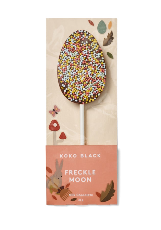
The company has also revised the presentation of its pops range to promote the product across all sizes, shapes and chocolate varietals – allowing people to “buy with their eyes”, as Thompson puts it.
“Flow wrapping the products on a two-side printed folded card sledge [card printed by Melbourne's Warritah Group] in clear BOPP film was a cost-effective solution that allowed high visibility of our products, dedicated information per SKU on each sledge [in-line date coding executed by a Domino printer], an easy and intuitive pack opening experience, plus simple separation of uncontaminated materials for recycling."
Also interesting about this pack, Thompson says, is that the design includes a notch on the card back to grip the pop stick when it passes through the flow wrapper. It's an important inclusion as, due to the hand-crafted process, the sticks can vary in positioning in the chocolate pop.
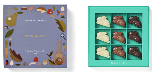
Commenting on the praline packs, Thompson says these were designed from a “user-first perspective” to frame, delight and wow during opening.

“Each of our boxes feature exquisitely embellished laminated papers wrapped over a rigid solid board core that was CNC-routed to tight tolerances. The outer structures are comprised of a lid, base, and upstand internal spigot, which creates a colourful split line gap.
“When the lid is removed a geometrically branded waffle paper – used for product protection is visible. On removal the waffle paper reveals a range of our handcrafted pralines – presented within a wide framed border and traditional grid interior that houses each individual praline," he says.
Print embellished cartonboard 'campaign sleeves' were used to brand the all year round boxes.
“Easter marks the start of Koko Black’s embarkation on a wonderful voyage into the world of exquisite packaging experiences – surpassed only by the pralines, treats and delights within,” Thompson says.
“My primary focus is to provide our customers with fun experiences across both our retail and online channels, while balancing operational efficiency and a premium handcrafted experience.”
Koko Black has 13 stores nationally, located in Melbourne, Sydney, Canberra, Adelaide and Perth. A new retail store opened on the corner of Collins and Swanston Streets in Melbourne’s CBD in April 2019.


