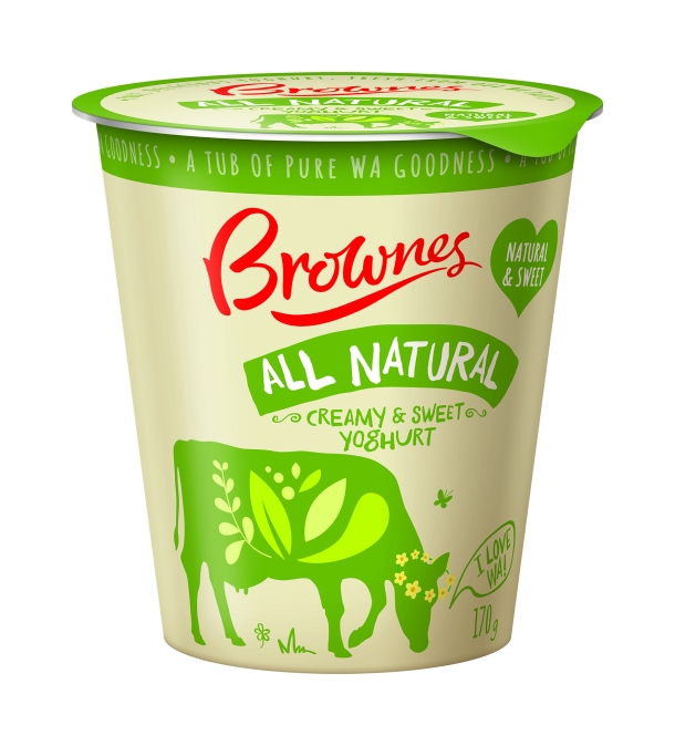
Packaging and branding design company Boxer & Co. has redesigned the West Australian Brownes Yoghurt range using “simple, honest language”.
The 33-SKU range has re-launched with the reformulation of existing recipes, and new flavours.
Already established as an “everyday essential” for the modern West Australian family, the brand owner wanted to convey quality and realness without looking too premium or expensive.

“It needed to be simple, accessible and honest, not over-complicated or fussy,” said Boxer & Co MD Gwen Blake.
“The challenge was to [convey] 'natural and nourishing', then balance it with 'delicious and pleasurable' without skewing the design too far into gourmet territory.
“Yoghurt can be a confusing category – the small pots and multiple players can lead to a lot of noise and the impression of ‘mess’ on shelf. Boxer & Co. needed to create a design that stood out from the crowd, but not necessarily by shouting louder in the same language as the other brands. It was time to find a new language for yoghurt.”
On the old packs, the Brownes brand was less prominent and didn’t translate into on-shelf stand-out or blocking of any kind, according to Blake.
The challenge was to include a cow in order to cue dairy, but to also use flavour and freshness connotations without the need of an extra pack element which would clutter the design and make it hard to convey purity. In the resulting Flavour Cow design, the cow heroes dairy farm freshness, but in a modern way. The outline of the cow in various poses is used to house fruit, flavours and illustrations that cue delicious taste and also allow for established category language, such as greek architecture for the greek variants.
Light pastel colours nod to the luscious, creamy nature of the yoghurt. They are subtle enough to retain a strong range look, but different enough to aid navigation. A series of hand-written fonts and doodles adorn the pack, adding authenticity. Additional hand-drawn elements like butterflies, daisies, speech bubbles, farm signs and grass, drive home provenance and realness. The inside of each label adds to the playful nature of the design, with fun cow facts and activities encouraging customer engagement and brand recall.


