The home chef trend may not have the fervour it did this time last year. And the world’s Masterchef television series are having to work harder to gain audiences. But home cooking has found its way back into the hearts and souls of family life. And nostalgic foods are finding new fans through this. Chelsea Sugar saw an opportunity for one of its foundation products to engage a new generation of New Zealand home bakers. So it asked creative strategy studio, Fly, to lend a hand. Here, Fly picks up the story:
“We started working with Chelsea Sugar in October 2012, defining brand strategy, key communications and how that flows consistently across TV, social media, in-store and PR.
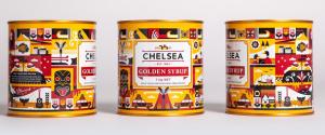
One of our major contributions we made was helping Chelsea be confident in their role as a heritage New Zealand brand. A brand with a powerful legacy in New Zealand, having been refined on the shores of the Waitemata since 1884. Chelsea's first foray into placing their legacy on the shelves, was the limited edition Golden Syrup tin inspired by a visit to the Chelsea Sugar Refinery…”

The illustrations are the creation of New Zealand artist, Greg Straight, who grew up near the Chelsea Sugar refinery on the North Shore of Auckland.
He used the natural surroundings of the Chelsea Sugar refinery and its views across the Waitemata Harbour to inspire his illustrations. The Fly designers worked with Straight to put the illustrations together to form the artwork for the tin, that has been the packaging form for Chelsea Sugar golden syrup since launch. Fly was also involved in overseeing the manufacturing process and even the filling of the tins, and filmed the whole process.
Designer, Tan Desai, then used the tin’s design as the foundation for the promotional products extending the new packaging into a promotional and advertising campaign. “My role was to work closely with the art director to translate the aesthetics of the tin into a variety of merchandise items, point of sale pieces and online banners that together created a great looking, cohesive integrated campaign."

Fly’s next project was to produce a limited edition tin inspired by the very first Golden Syrup tin for the brand’s 130th anniversary.

The major objective was to achieve a noticeable difference by stripping away all the clutter that is found on contemporary packaging design and present a clean, crisp and authentic heritage tin. The second objective was to duplicate the beautiful gold of the original tin, and its one colour red screen print.
This has become the first in a series of projects that Chelsea Sugar intends to do to celebrate its 130th birthday in 2014.
Creative credits:
Agency: Fly
Creative director: Johnson McKay
Art direction: Johnson McKay
Illustrator: Greg Straight
Design: Tanmay Desai & Jay Watson


