


McDonalds has launched a new range of packaging in line with its changing image, and to serve as a billboard for the brand.
From 2013 to 2015, McDonald’s bags looked like this.
But the burger company is wanting to make a progressive statement by rolling out new-look packaging that looks like this.
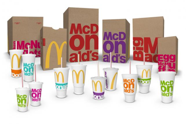
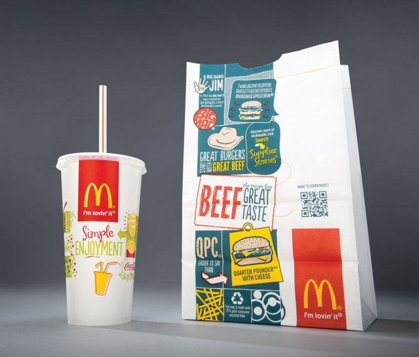
Bags and cups now feature bright lettering and an updated take on the iconic golden arches.
It is the chain's first global packaging overhaul in three years, and designers from seven different agencies are behind the re-vamp.
Each of them responded to a brief to come up with packaging designs that would be “true, bold and simple”, and which work with McDonald's updated designs in its restaurants and social media sites.
The new packaging follows a string of sales declines in 2014 and is described by the company as a “new billboard for the brand".
Local design input came from Creata Australia, with artists assembling in London in early 2015 to brainstorm packaging ideas.
The front of one bag features the golden arches, which stretch to the adjoining side panel. The other large side of the bag might include the name of a top-seller such as Big Mac, Chicken McNuggets, Egg McMuffin or French Fries, in a bright hue.
The updated packaging coincides with the 25th anniversary of McDonald's doing away with styrofoam "clamshell" containers.
It still aims for all its fibre-based packaging to come from recycled or certified sustainable sources by 2020. By the end of 2014, McDonald's US was sourcing about 27 per cent of its fibre-based packaging from such sources.
While the environmental impact of the new bags has not been publicly disclosed, in some cases the overhaul means less of the bag is printed with ink, compared to the prior Brand Ambition design that focused on McDonald's people, food and community. The brand will continue the use of brown paper, which includes post-consumer recycled content.
The new look is starting to pop up in the US before heading around the globe.


