Palmolive has announced a shampoo and conditioner brand relaunch, a sub-range of shower gels, and a new scent for its foaming hand wash and sanitiser products.
1. Naturals Shampoo and Conditioner: Bottle re-launch
This range has a new bottle and graphics, and an improved formula. Palmolive engaged Tweak to develop the shopper key visual, to be leveraged across in-store POS, advertising, and online materials. Following consumer product trials they found that 93 per cent of consumers that tried the new Palmolive Naturals would buy it.
The new look pack includes a metallic circular frame which surrounds the variant ingredient imagery. This element inspired the circle structures, which are easily recomposed for narrow web banners or large posters while maintaining a consistent overall look. The New Formula icon backs up the key statement and informs of a real product improvement. The hexagonal shape is reminiscent of molecular structure diagrams, and a visual reference to the formula. A green leaf textured background was used to convey the message of ‘natural’.
2. Body Polish: New sub-range
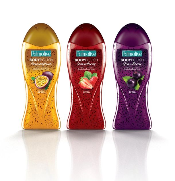
These premium-positioned shower gels include real kiwifruit and apricot seeds for exfoliation, and fruit extracts with antioxidant properties. The clear packaging form combined with a clear label maximises product show-through, allowing the consumer to see the seeds and colour. Restrained, clean typography sets the premium tone, while the fresh fruit photography entices. Inspired by market freshness, brown paper texture and white panelling sets the backdrop, allowing the richly coloured packaging and bold typography to pop. The packaging form is composed within a burst of fruit, seeds, and gel, creating a sense of energy and fun around the product, as well as showing the real ingredients inside.

3. Foaming Hand Wash and Sanitiser: Sweet addition
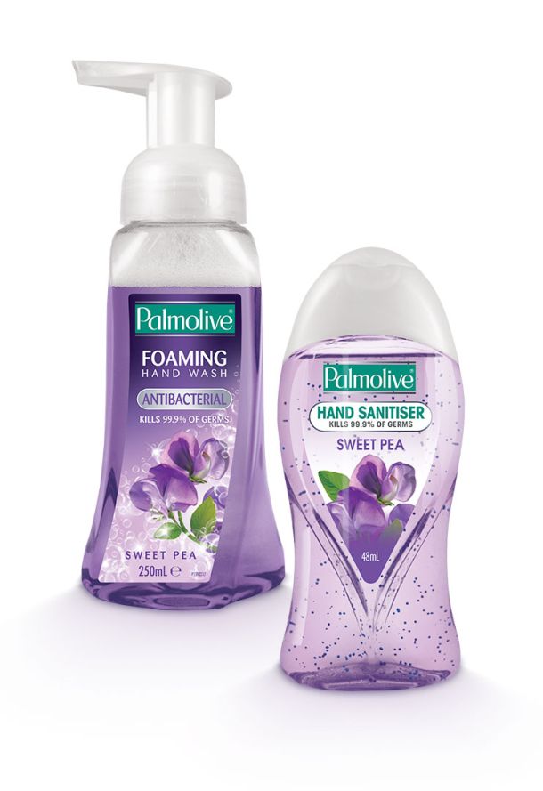
A variant of Sweet Pea has been incorporated into the ranges. Due to the small label sizes and extensive range, the company says there's a risk a new variant will go unnoticed. POS items have been designed to introduce Sweet Pea and further highlight its sensorial experience. The scale of its imagery and variant colour was maximised in the POS to appeal to consumers looking for the latest fragrance sensation. The Palmolive generic POS architecture was used as the basis for the designs, to link the product back to the strength of the mother brand's key attributes.


