Spice brand, Rubyspice, began making its mark immediately, even in South Australia where new niche food brands blossom frequently.
“RubySpice is all about the joy of experiencing spice and bringing friends and family together over meals created with real flavour,” founder Jackie Singh said of her philosophy. Her company, RubySpice Spice Emporium, won silver at the Design Institute of Australia’s 2014 Awards in communication category for Adelaide team Parallax Design.

PKN asked Parallax design owner, Matthew Remphrey, about the thinking that led to the branding, then its packaging, then its first accolade.
PKN: Where did the branding idea for Rubyspice come from, what were your primary objectives?
Matthew Remphrey: Rubyspice is a new spice retailer in Adelaide set up by food and spice queen, Jackie Singh. Jackie selects and blends all of her creations by hand. They are a taste sensation and compliment a myriad of cooking styles - taking you on a global spice adventure. Rubyspice is all about fun, flavour and the joy of experiencing the spice of life. Parallax worked with Jackie on this positioning and how best to convey it to her target audience through identity, packaging, food styling, interiors and online.
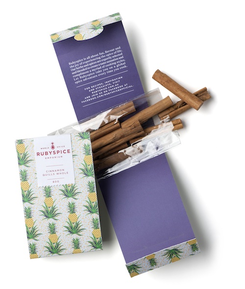
Jackie came to Parallax with the name, Rubyspice, and an appreciation of anything tropical. Our research found that the pineapple is the king of fruits and is given as a symbol of welcome throughout the tropics. The logo developed for Rubyspice depicts a precious ruby stone, disguised as a pineapple. The pineapple also holds a special place in the development of the early spice trade. A bespoke wallpaper pattern was also developed for use on packaging and interiors.

PKN: How did the branding progress from idea to execution?
MR: We commissioned an illustrator to create the proprietary pattern and set about sourcing all of the packaging requirements from local and overseas suppliers. The tins were the hardest thing to source. Rubyspice prides itself on freshness, so the tins were a very important component. We wanted a tin with a clear panel so what was inside was perfectly visible, and it was vital that the seal was strong but still easy to use.
As the project progressed, creating a retail shop became less of an objective. Jackie instead established a kitchen. We worked with a shop fitter to create a flexible space where she can produce, store and host pop up cooking events. Hand selling to independents, at markets and gifting is her main focus with her online store being due for launch shortly.

PKN: You also did the packaging design, so please share the packaging details.
MR: The Rubyspice identity and business card is printed five colours onto Rives Design with a red foil.
The 25g and 50g spice tins are printed in a four colour process, with a clear panel lid. A rubber freshness seal on the lid keeps the tin airtight. Clear tamper proof labels and ingredient labels are digitally printed with the blend names and applied to the tin after each is hand filled. Larger herbs and spices are placed into clear bags, heat sealed and then wrapped within a cardboard sleeve. Digitally printed labels seal the sleeve. Rubyspice printed calico draw string bags are used to create kits and make great gift giving.


