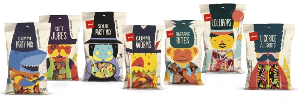
Brother Design has created another success for NZ retailer Foodstuffs Pams house brand, this time in the competitive confectionery aisle.
Design elements that proved winners were the colourful, cute characters and the product windows integrated into the design that let kids get their 'eyes on the prize'.
It's not the first award for the Pams Confectionery range. It won a Dieline award earlier this year, and now has been recognised by the Design Institute as the best in Packaging, topping the new sub category for FMCG packaging design for large volume and export products and then taking the overall Gold Pin.
“There’s such stiff competition in the Best Awards, so it’s a real honour to win,” said Brother's design director Paula Bunny.
The addition of the FMCG packaging category to the competition this year paved the way for the Pams entry.
“The Pams brand could never have entered in the past so it’s fabulous to be locally recognised for our creative work,” Bunny said. “It’s such a great brand to work on, demanding we be fresh and distinctive in every single category of the supermarket, and that’s quite a challenge in the busy confectionery aisle.”
Brothers’ business development director, Jenny McMillan, says the brief was a challenging one. “With Pams, we always want to stand out from the expected, generic look of a category’s big brand leaders. The challenge here was to do so in a sector that’s bursting with loud, colourful designs. Paula’s work does it brilliantly, with captivating characters, large product windows for a tempting peek at the lollies, and colours that reflect these sweet treats contain no artificial colours or flavourings.”

Other successes for Brother in the competition included nominations for their Pentawards-winning work on Pams Feminine Hygiene range and for Farrah’s wraps, which had previously won Supreme Award at the Pride in Print awards earlier this year.


