• Saltmine began by shifting the colour palette to richer tones that are less artificial, modernising the typography and encompassing the map of Australia within a lozenge device.
    Saltmine began by shifting the colour palette to richer tones that are less artificial, modernising the typography and encompassing the map of Australia within a lozenge device.
  • Saltmine began by shifting the colour palette to richer tones that are less artificial, modernising the typography and encompassing the map of Australia within a lozenge device.
    Saltmine began by shifting the colour palette to richer tones that are less artificial, modernising the typography and encompassing the map of Australia within a lozenge device.
Close×

Fifty-year-old bakery brand Tip Top has had a makeover, and its brand design agency says it's the best thing since sliced bread.

Saltmine Design Group was commissioned to overhaul the Tip Top masterbrand identity and product packaging to “fully leverage its leadership position” in the category.

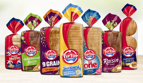
The result is a new brandmark and packaging design for the entire range.

Saltmine began by shifting the colour palette to richer tones that are less artificial, modernising the typography and encompassing the map of Australia within a lozenge device to create a bold brand stamp.

The ‘established in 1958’ credential was added to support Tip Top’s experience and leadership position.

Saltmine introduced a red swoosh device to the brand’s visual identity, which is used on-pack to frame the window and highlight the product.

When it came to redesigning the packaging for more than 30 SKUs, a front face design that extends to include the base of the pack was created.

Additionally, Saltmine included a big window to the bread to highlight the freshness of and pride in the product.

Falling wheat, grains and fruit were used to reinject food cues and add appetite appeal to the previously static pack design.

The 'Good on ya Mum' sign-off has been evolved in design, but the phrase stays true to the familiar saying.

The full range includes Tip Top Sunblest, Tip Top 9 Grain, Tip Top Breakfast range, Tip Top English Muffins, Tip Top Texas Toast, Tip Top  The One, and Tip Top Rolls range.

This was the bread range before the makeover:

And this is how it looks after the redesign:

Saltmine began by shifting the colour palette to richer tones that are less artificial, modernising the typography and encompassing the map of Australia within a lozenge device.

Food & Drink Business

Hang 10 Distillery was created by Deon Rowe and Marine Raynard after the ABC’s War on Waste series inspired them to find a way to tackle food waste by making sustainable spirits. Keira Joyce speaks to the pair about the road to making a world-first whisky with leftover sourdough.

Trending into 2025

Whether consumers are trying to drink less, eat more protein or focus on a more wholefood diet, understanding consumer behaviour is a key component for innovation, NPD, and growth in the food and beverage sector. Kim Berry looks at some of the main motivators in 2025.

Scientists from Hunan Agricultural University in China have developed a new strain of rice that emits up to 70 per cent less methane, aiming to tackle the 12 per cent of global methane emissions resulting from rice cultivation.