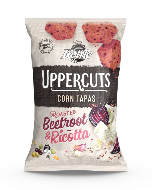
Kettle has launched its new range corn tapas chips, Kettle Uppercuts, teaming with Sydney design agency Tweak to add graphic and haptic texture to its packaging design.
Following a hessian fabric theme, the Uppercuts design uses Kettle’s distinctive black brand panel as the foundation to the design, complemented by colourful ingredient photography and typography.
Tweak senior designer Shane King said the hessian graphic texture was enhanced with a matte varnish and spot gloss to the packaging itself, helping it stand out on shelf.
“The matte varnish is used over most of the design to add a tactile quality to the hessian texture and signify the products healthy ingredients premium quality,” he said.
“On areas such as the variant descriptors, logo and sub-brand, we gave a gloss quality. This effect highlights those areas and giving them richer brighter colours.”

The Kettle Uppercuts design features playful typography across its packaging, both to maintain the Kettle brand name and target the corn chip consumer.
“The ‘Corn Tapas’ typeface is a call back to the Kettle core, [while] the flavour descriptor typefaces are inspired by vintage sign writing and street menu boards,” said King.
“They are designed to express a sense of full flavour and link to the ingredient imagery by use of colour, texture and composition.”
The Kettle Uppercuts range is available is now available in four flavours: feta and sweet roasted garlic, jalapeño chilli and Mexican lime, jalapeño chilli and manuka honey, and roasted beetroot and ricotta.


