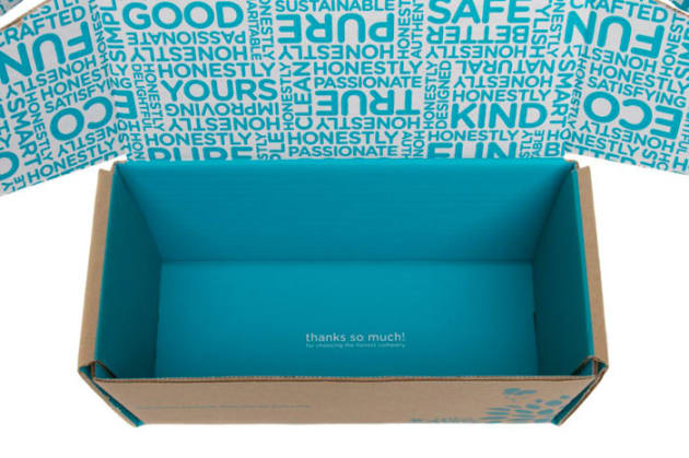
The trend towards 'real and authentic' will continue to be seen across a range of pack designs in 2017.
This is the opinion of several top design agency executives, who told PKN what they believe to be the key features of successful pack designs in the months to come.
“We're seeing an ever-increasing super-trend towards 'naturally organic' and, to a larger extent, artisan,” Jam & Co general manager of operations Ian Segail says.
“Consumers are looking for more tailored products specific to them and their needs, and they want to know that what they’re buying has been handcrafted.”
Segail believes this is evident in the growth of “fresh” sections in supermarkets, as well as the large number of products with an earthy look and feel, including distressed typography and a natural colour palette.
“This trend extends not only across health food aisles but into everything from laundry to pets,” he says.
“Indeed, we’re already seeing this trend in the pet food aisle, with brands showcasing ‘natural’ ingredients, no preservatives, and a focus on human-grade ingredients imagery on pack.”
Saltmine's recent design work on the Farmers Market pet food range for The Real Pet Food Company is one example. MD Sara Salter (pictured below) agrees authenticity is still important to people – but “truth” on packaging even more so.
“In 2017 we're going to see a movement from authenticity to truth,” she says.
“The difference is that truth is not as 'perfect' as authenticity because the truth is never perfect.
“We need to say goodbye to overly retouched images on our packaging and present consumers with the truth instead. If it looks too perfect, it probably is – and this just sets you up for disappointment and rejection.”
What Came Next's Ruth Galloway says it's important to “strip it back and show them who you really are”.
“We're seeing a rapid departure from the 'faux honest' and overtly 'handcrafted’ look that has ruled the shelves these last few years,” she says.
“Brands will have to work hard to truly understand and distill their identity.”
She says legislation will also drive clarity.
“We will use less words, honestly presented, and symbols and signs will become shortcuts to clarity.”
The Creative Method creative director Tony Ibbotson, whose team designed the Sumo Salad packaging pictured above, says more consumers are wanting to know where their products are from, who made them, and how they're made.
“This will drive further storytelling and craft on packaging that reflects that the product is made by a person and not a machine,” he says.
“More designers should probably look to get off the computer and do more by hand. Traditional hand-lettering and signage is already making a big comeback.”


