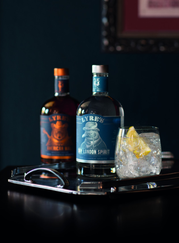
With the non-alcoholic spirits trend on the rise, Lyre's is standing out not only on store and bar shelves with its Art Deco inspired packaging design, but also by matching its production techniques to the same era.
Lyre's worked with Sydney-based design agency The Kinetic Agency to achieve intricate and detailed labels, using stencil-style art teamed with animal characters across its range.
Mark Living, Lyre's co-founder and CEO, said the team was determined to evoke the golden era of cocktail making, the prohibition period of the 1920s.

“It’s important that in order to evoke the art deco period we were influenced by, that we constrained ourselves to the production techniques of the time,” said Living.
“This meant sticking with very simple, line artwork and a palette of only a single colour per bottle. These constraints force you to get creative within the design process, and we often find that by setting some boundaries we get great results.”
The Lyre's labels were printed by Perth's Labelmakers and uses uncoated matte stock with a polyester backing, “for wet-strength in case they’re placed in the fridge”, with in-line foil used for the metallics.
Living also adds each variant in the Lyre's range is distinguished by its “strange menagerie of anthropomorphic animal characters” and is inspired by the providece of the original alcoholic spirit the drinks are based on.
“For example, our American Malt, which is our interpretation of Bourbon, features a North America Black Bear, and our Dry London, which is our interpretation of Gin, features a London Pigeon. We plan to give these animals voices and enrich the brand with their antics in the future. It’s all a bit strange really, but that’s what we were going for.”
Since launching in March, Lyre's has been accepted into the Amazon Launchpad program, is being served at The Opera Bar in Sydney, and has secured its range with Southern Glazers Wine & Spirits in the USA.


