The Squad Ink branding agency has added more medals to its collection, scooping four Golds and three Masters awards at this year’s Design & Packaging Masters Awards.

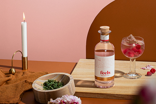
Gold awards went for its Archie Rose Signature Dry Gin in the Gin Category, Archie Rose Native Botanical Vodka in the Vodka Category, Archie Rose Rye Malt Whisky in the World Whisky Category, and Feels Rouse Eau De Vie in the Specialty Spirit Category.
Scooping Masters Awards were distilled spirits Seabourne Coastal Dry Gin and Archie Rose Bone Dry Gin, both in the Gin Category, and Grand Talon Rice Whisky in the World Whisky Category.
Founded by creative duo and twin brothers Matthew and Terry Squadrito, Squad Ink has forged a reputation for creating some of the most sought after artisan food and beverage brands in Australia.
“We are incredibly humbled and proud to have the trust of such incredible clients who allow us to push the boundaries of design and packaging. We consider these wins as a thank you to our clients and their faith in our work”, said Terry Squadrito.
Sydney-based distillery, Archie Rose Distilling Company, a long-time partner of Squad Ink, co-accepted an impressive three Gold medals and the prestigious Masters in the Gin category for Bone Dry gin. Archie Rose broke new ground with its latest world-leading, cold distillation technique to capture what it claims is the truest and most complex notes of juniper.

(Gin Category)
Squad Ink realised this with a minimalistic design — a clean white main label with a hit of deep juniper purple. But upon closer inspection, the intricate illustrations are revealed via an experimental blind deboss on Casa Blanca stock that creates transparency, allowing light to shine through the crystal clear spirit.
Squad Ink also garnered major attention taking home the Masters Award in the Gin category for Seabourne Coastal Dry Gin; a newly launched distillery based in Noosa on Queensland’s tropical coast. The agency created a custom internal punt feature within the bottle to emulate Noosa’s fairy pools. Also featured is a specialty Manter Cotone Bianco stock label hit with deep blue and a rooftop dimensional emboss to proclaim Seabourne in crisp clarity.
“Squad Ink built Seabourne like it was their own,” says Seabourne founder Hayden Weir. Their hard work, advice, attention to detail and stretching the limitations on what’s possible is why they’re the best in the business.”
Southern China-based Grand Talon Rice Whisky also received the Masters award in the World Whisky category, thanks to Squad Ink’s inventive interpretation of Chinese rice spirit-making tradition blended with Western barrel-aging techniques. The folklore rain dragon comes to life through a custom bottle design — drawing inspiration from the scales of the dragon that, when sculptured in glass, resemble a cut crystal whisky decanter.
“It’s fantastic dreaming up a show-stopping packaging concept, but the real feat is realising it in the flesh, so the result is savoured just as much as the drop itself. We have to take our hats off to the Squad production team for the technical excellence they bring to the bottle, said Matthew Squadrito.
Feels Eau De Vie rounded out the collection, with a Gold medal in the Specialty Spirit Category for its Rouse Spirit, which features a trio of sustainably-sourced Australian botanicals with therapeutic benefits. Squad Ink’s design challenged the status quo through a typographic-led label design that embraced emotive wording to capture the feeling or mood of each spirit.
The Design & Packaging Masters Awards serve as part of the internationally renowned Global Spirits Masters series, with each entry judged by a panel of industry-leading distributors, educators and bartenders.


