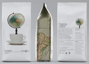
Australian consumers understand high quality coffee. In 2013, off-trade value sales increased by 6%, taking the category to A$1 billion.
The increasing sophistication of the Australian palate is apparent, with consumers becoming very discerning in terms of flavour and origins of coffee beans. There are therefore large numbers of premium coffee types available, including organic, fair trade, sustainable, single-source, carbon-neutral and micro-roasted artisanal among others. The market is growing and growing in competitivness. Even Mondelez has joined the fray.
According to Euromonitor, “Australia’s appreciation of coffee is set to continue with a projected 3% total volume CAGR over the forecast period and an expected CAGR of 5% in off-trade constant value terms. The Australian palate will continue to develop and mature, and coffee companies will need to understand the changing needs of the consumer to remain competitive.”
Rio Coffee is meeting that challenge particularly well. In May 2012, John Russo, operations manager at Rio Coffee visited Jet Technologies at the Melbourne International Coffee Expo with the decision to completely rebrand the company's premium range of coffee and shift production from a labour intensive pre-made bag process, to a fully automated fill and seal process using printed reels and a Goglio machine.
That decision resulted in Jet Technologies and Goglio working together to construct the perfect die-line and machine specifications for Rio's demands, three primary formats and subsequent volumes based around a G21 VFFS machine.
Then came the shelf shout aesthetics that made Rio's star shine. Rio, its design agency Voice and Jet Technologies teamed up to create the perfect laminate structure, bag format, sealing bar profile and rotogravure printing and finishing techniques to ensure that Voice's new designs ‘came to life’ on the shelf.
That lengthy process is now complete.

The Rio Blends range packaging uses intriguing imagery to depict the exact experience coffee drinkers will get from Rio – a mighty stallion represents the kick of Rio Blend espresso, the smooth comfort of the armchair depicts the experience of Rio Crema. The strikingly uncluttered pack design snares the attention of shelf browsers.
The Rio Single Origin range is completely different again. Its design is abuzz with detail. Voice felt that “the packaging should convey the same excitement and enthusiasm with which the beans have been sourced and locally roasted.” Each box is a collage of illustrations depicting the landscape, people and coffee production of its homeland and the enjoyment to be gained by drinking the coffee.
Creative credits:
Artist: Nate Williams
Creative Agency: Voice
Art Direction & Design: Tom Crosby


